

Do I need a new logo? 7 signs here that you do.

Refresh your brand! Explore the options that will help you stand out!
Logos are important for every business. They represent your company’s identity and are part of the fabric of your business. They provide triggers for customers and potential customers. Companies such as Coca Cola, Nike and Tesla have immediately recognisable logos and this is achieved through good design, good brand placement and consistency in how their marketing is presented to the public and potential audiences,
There will be times when we should challenge how our logo looks. The following 7 observations will lead to a “Yes, yes we do need a change!”
The current colours convey negative message
The research about the impacts of colour on people’s reactions is clear. The link between brand identity and colour is a strong relationship. Studies conducted by Larecque and Milne show that over 75% of credit card logos contain the colour blue while only it is present in only 20% of fast food brands. On the other hand red features in no apparel logos but 60% of retail brands. Why is that you ask?
Colour creates visual cues. We are swamped everyday with thousands of logos so the use of colours enables unconscious messages about what is being sold and who is selling it to us. Relating back to blue and red, blue is a colour that comes across as safe or inoffensive, sophisticated and trustworthy. It is no surprise that banks, insurance companies and health providers rely heaviliy on blue in the core of their logos. Red is a colour that invokes passion and is a bold choice for a brand. There is a strong link between food and retail industry and the colour red.
If your business is a luxury brand associated with quality products and your logo is brown (associated with ruggedness, seriousness and nature) then you might consider a change to colours that convey luxury e.g. purple which conveys luxury and regalness.
2. Your logo is difficult to read
If your logo is a combination of marks and fonts and the typeface that is used is difficult to read then you may wish to consider a change. Ask many people around you for their opinion on legibility. Customers and potential customers should be able to immediately decipher who you are, even if they are unaware of what you do.
Here’s a link to more information on how single, double and triple letter logos incorporate easy-to-read fonts.
How To Create Letter Logos Instantly (logodesign.net)
3. Your logo’s shape is awkward
The science about shape and the perception of shapes is clear. Round logos are more inviting to a reader as they have less harsh edges. Triangles and squares do serve a purpose. Triangles communicate motion and movement. YouTube use the triangle as part of their logo which conveys the idea of “push play”. Squares convey strength, professionalism and practicality. There are a myriad of other shapes you can choose, however, the shape needs to work closely with the asssociations of font selection and logo colour to build the right message of your brand overall.
This article is worth a read which also discusses the meaning behind the use of horizontal and vertical lines
4. Logo scalability
One thing that is important to get right is how the logo will look when it is really, really big or really, really small. Can you see all the detail when it is teeny weeny or does everything crash together and you see a black blob?
How well does it look in black, white and full colour? If you’ve tested your logo’s scalability and readability at different sizes and you are finding that you are being stopped from being able to see the detail then it is definitely time to change it up.
5. Memorability
Flat, boring and unmemorable are not the words that should describe your logo. Have you asked your customers what they think about your logo? Would they instantly recognise and connect it as your company or you? If you get feedback indicative of flat, boring and unmemorable then this is a sure sign that your logo needs work.
Your logo does not need to be over-the-top from a design perspective but it does need to be memorable. Brands like Chanel and Nike have longevity and instant recall. A good logo designer should be looking for that “edge” for your logo. Simplicity is often the key and a designer will carefully consider the wordmark, spacing, font and usage of colour to help you stand out in a busy marketplace.
6. Your logo looks like your competition
If your logo gets mixed up by customers and potential customers with competitors of yours then Houston we have a problem. Standing out from the crowd in a busy trading world is vital and this starts with your logo. Take a look at the Gucci and Chanel logos.

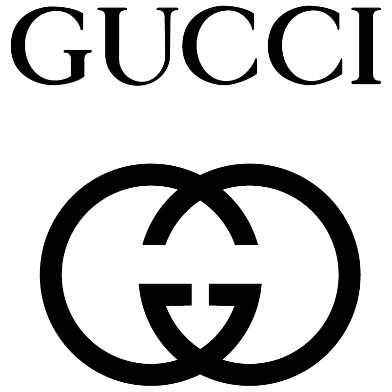
These logos are often reproduced without the name laid bare in full. Can you see how there might be confusion if the graphic is the only thing representing either brand?
A refresh for this reason does not necessarily mean throwing the baby out with the bathwater but it might mean a number of suitable tweaks to create real differentiation between you and your competition.
7. Do the fonts in my logo convey the right message?
So we know that your logo should be a representation of your brand right? So then if you have a professional business selling to healthcare facilities would you use a font like Comic Sans?

Comic Sans font is mostly associated with child’s play and not professional businesses
The answer is probably no. If your font is not right in your logo for representation of your brand then it’s time for a refresh.